
https://material.io/resources/color/ 사이트에 접속한다.

위와 같은 기본 UI 구성을 할 수 있도록 구성되어 있다.
먼저 Primary 를 선택하고 색상표에서 원하는 색상을 선택한다.
그 다음에 Secondary를 선택하고 원하는 색상을 선택한다.
Text on P 도 마찬가지로 색상을 선택하거나 Custom에서 선택한다.

내가 예시로 선택한 화면이다.
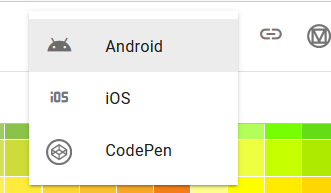
이제 Export를 눌러서 Android를 선택하여 저장하면 color.xml 파일로 저장된다.
|
<!--?xml version="1.0" encoding="UTF-8"?-->
<resources>
<color name="primaryColor">#2196f3</color>
<color name="primaryLightColor">#6ec6ff</color>
<color name="primaryDarkColor">#0069c0</color>
<color name="secondaryColor">#ededed</color>
<color name="secondaryLightColor">#ffffff</color>
<color name="secondaryDarkColor">#bbbbbb</color>
<color name="primaryTextColor">#ffffff</color>
<color name="secondaryTextColor">#000000</color>
</resources>
|
Material Design color palettes
https://material.io/design/color/the-color-system.html#tools-for-picking-colors 사이트에 색상표가 잘 표현되어 있다.
스타일 및 테마
https://developer.android.com/guide/topics/ui/look-and-feel/themes?hl=ko
스타일 및 테마 | Android 개발자 | Android Developers
스타일 및 테마 Android에서 스타일 및 테마를 사용하면 웹 디자인의 스타일시트와 유사하게 앱 디자인의 세부사항을 UI 구조 및 동작과 분리할 수 있습니다. 스타일은 단일 View의 모양을 지정하는
developer.android.com
Theme 와 Dark Theme 를 고려하여 List Item 의 구분선을 표시하고자 할 때
<solid android:color="?attr/backgroundColor"/> 와 같이 배경색 지정을 Theme 와 Dark Theme 각각 다르게 인식할 수 있도록 ?attr/backgroundColor 로 처리하면 된다.
res/drawable/bg_border.xml
|
<?xml version="1.0" encoding="utf-8"?>
<layer-list xmlns:android="http://schemas.android.com/apk/res/android"
xmlns:app="http://schemas.android.com/apk/res-auto" xmlns:aapt="http://schemas.android.com/aapt">
<item>
<shape android:shape="rectangle">
<padding android:left="0dp" android:top="0dp" android:right="0dp" android:bottom="1dp"/>
<stroke android:width="1dp" android:color="#ebebeb"/>
</shape>
</item>
<item>
<shape android:shape="rectangle">
<solid android:color="?attr/backgroundColor"/>
</shape>
</item>
</layer-list>
|
디자인 감각 부족으로 테마 색상 표현력이 부족 하지만, backgroundColor 는 흰색과 검은색으로 테마에 따라 구분되어지는 걸 확인할 수 있다.
어두운 테마(Dark Theme)는 Android 10 (API 레벨 29) 이상에서 제공된다.
MaterialComponents의 어두운 테마 설정을 사용할 수도 있다.
<style name="AppTheme" parent="Theme.MaterialComponents.DayNight">
|
<resources xmlns:tools="http://schemas.android.com/tools">
<!-- Base application theme. -->
<style name="AppTheme" parent="Theme.MaterialComponents.DayNight.NoActionBar">
<!-- Primary brand color. -->
<item name="colorPrimary">@color/blue_700</item>
<item name="colorPrimaryVariant">@color/blue_200</item>
<item name="colorOnPrimary">@color/white</item>
<!-- Secondary brand color. -->
<item name="colorSecondary">#ff625b71</item>
<item name="colorSecondaryVariant">@color/teal_700</item>
<item name="colorOnSecondary">@color/black</item>
<!-- Status bar color. -->
<item name="android:statusBarColor" tools:targetApi="l">?attr/colorPrimaryVariant</item>
<!-- Customize your theme here. -->
<item name="backgroundColor">@color/white</item>
</style>
</resources>
<!-- Dark Theme -->
<resources xmlns:tools="http://schemas.android.com/tools">
<!-- Base application theme. -->
<style name="AppTheme" parent="Theme.MaterialComponents.DayNight.NoActionBar">
<!-- Primary brand color. -->
<item name="colorPrimary">@color/blue_500</item>
<item name="colorPrimaryVariant">@color/blue_200</item>
<item name="colorOnPrimary">@color/black</item>
<!-- Secondary brand color. -->
<item name="colorSecondary">#ffccc2dc</item>
<item name="colorSecondaryVariant">@color/teal_200</item>
<item name="colorOnSecondary">@color/white</item>
<!-- Status bar color. -->
<item name="android:statusBarColor" tools:targetApi="l">?attr/colorPrimaryVariant</item>
<!-- Customize your theme here. -->
<item name="backgroundColor">@color/black</item>
</style>
</resources>
|
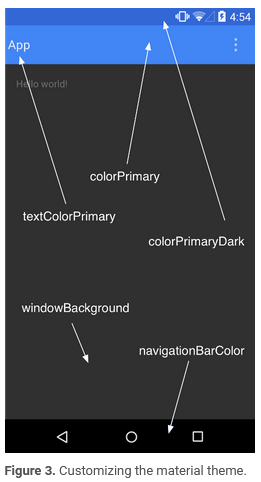
http://android-doc.github.io/training/material/theme.html 에 각 영역의 색상 폰 이미지를 참조하면 된다.
'안드로이드 > Layout' 카테고리의 다른 글
| CoordinatorLayout custom toolbar (0) | 2021.08.29 |
|---|---|
| Material Components color (0) | 2021.08.19 |
| Shape Drawable로 간단한 배경 이미지 활용 (0) | 2021.08.12 |
| CardView tools:visibility (0) | 2021.08.12 |
| android 검색 + 버튼 배치 (0) | 2021.03.14 |

Link2Me