
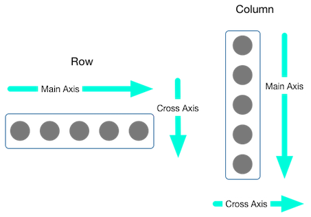
일반적으로 플러터의 레이아웃은 그리드 구조로 이뤄지고, 이는 행과 열을 의미한다.
따라서 행 위젯과 열 위젯이 있다. 각 항목에는 하나 이상의 자식이 있을 수 있고, 행 위젯의 경우 가로로 배치하고, 열 위젯은 세로로 배치한다.
플러터 Layout 구성에 필요한 위젯은 https://docs.flutter.dev/development/ui/layout 에 잘 설명되어 있다.
한글 설명 일부는 https://flutter-ko.dev/docs/development/ui/layout/tutorial 를 참조한다.
Container 위젯 : 기본적으로 최대한의 공간을 차지하여 표시된다.
Padding 위젯 : 자식 위젯 주위에 padding을 표시
Center 위젯 : 자식 위젯을 중앙에 표시
Column 위젯 : 자식 위젯들을 세로로 정렬하여 표시
Row 위젯 : 자식 위젯들을 가로로 정렬하여 표시
예제 소스코드
|
import 'package:flutter/material.dart';
import 'bottom_navi_bar.dart';
import 'myapp_demo.dart';
void main() {
runApp(const MyApp());
}
class MyApp extends StatelessWidget {
const MyApp({Key? key}) : super(key: key);
// 화면 표시에 대한 역할은 Scaffold 위젯이 담당한다.
// MaterialApp 위젯은 화면 이동과 테마 지정이 주요 역할이다.
@override
Widget build(BuildContext context) {
return MaterialApp(
title: 'Flutter Demo',
theme: ThemeData(
brightness: Brightness.light,
appBarTheme: AppBarTheme(
color: Color.fromARGB(131, 52, 215, 229),
),
primaryColor: Colors.lightBlue,
accentColor: Colors.greenAccent,
fontFamily: 'Raleway'),
darkTheme: ThemeData(
brightness: Brightness.dark,
),
//home: const BottomNaviBar(title: '플러터 데모 Main'),
home: MyAppDemo(),
);
}
}
|
|
import 'package:flutter/material.dart';
// Android Studio 에서 stless 탭키(또는 엔터키)를 누르면 자동으로 만들어진다.
// 여기에서 클래스 이름만 지정하면 된다.
class MyAppDemo extends StatelessWidget {
//const MyAppDemo({Key? key}) : super(key: key);
@override
Widget build(BuildContext context) {
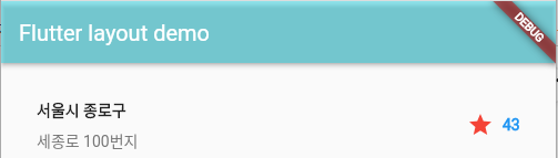
return Scaffold(
appBar: AppBar(
title: Text("Flutter layout demo"),
),
body: Column(
children: <Widget>[titleSelection],
),
);
}
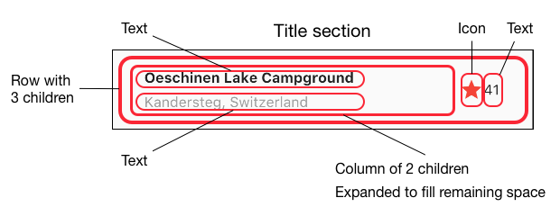
// 컨테이너 위젯 구현
Widget titleSelection = Container(
// 컨테이너 내부 상하좌우에 32픽셀만큼의 패딩 삽입
padding: const EdgeInsets.all(32),
// 자식으로 row를 추가
child: Row(
// 위젯들(Expanded, Icon, Text)을 자식들로 추가
children: <Widget>[
// 1 : Expanded widget안에 Column을 넣으면 row의 남은 공간을 모두 채우게 된다.
Expanded(
child: Column(
crossAxisAlignment: CrossAxisAlignment.start, // 자식들을 왼쪽정렬로 배치함
// 컬럼의 자식들로 컨테이너와 텍스트를 추가
children: <Widget>[
Container(
padding: const EdgeInsets.only(bottom: 8),
// 컨테이너 내부 하단에 8픽셀만큼 패딩 삽입
child: Text(
"서울시 종로구",
style: TextStyle(fontWeight: FontWeight.bold // 텍스트 강조 설정
),
),
),
Text(
'세종로 100번지',
style: TextStyle(color: Colors.grey[600] // 텍스트의 색상을 설정
),
)
],
),
),
Icon(
Icons.star, // 별모양 아이콘 삽입
color: Colors.red[500], // 빨간색으로 설정
),
Padding(padding: EdgeInsets.all(4)),
Text(
'43',
style: TextStyle(color: Colors.blue, fontWeight: FontWeight.bold),
), // 텍스트 표시
],
),
);
}
|
Expanded 위젯

Expanded 위젯은 Column 위젯, Row 위젯과 함께 사용하여 웹 개발에서 사용되는 flex와 같은 기능을 구현할 수 있다.
|
@override
Widget build(BuildContext context) {
return Scaffold(
appBar: AppBar(
title: Text("Flutter layout demo"),
),
body: Row(
children: <Widget>[
Expanded(
child: Container(
color: Colors.blue[200],
),
flex: 3,
),
Expanded(
child: Container(
color: Colors.grey[100],
),
flex: 7,
),
],
),
);
}
|
Stack 위젯
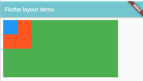
Stack 위젯을 사용하면, 위젯 위에 위젯을 표시할 수 있다.
|
@override
Widget build(BuildContext context) {
return Scaffold(
appBar: AppBar(
title: Text("Flutter layout demo"),
),
body: Container(
padding: const EdgeInsets.all(10),
child: Stack(
children: [
Container(
width: 400,
height: 200,
color: Colors.green,
),
Container(
width: 100,
height: 100,
color: Colors.deepOrange,
),
Container(
width: 50,
height: 50,
color: Colors.blue,
),
],
),
),
);
}
|
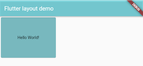
SizedBox 위젯
Container 위젯과 SizedBox 위젯은 둘 다 width와 height를 가진다.
Container 위젯은 width와 height를 넣지 않으면, 최대 크기로 확장해준다.
SizedBox 위젯의 height나 width의 default 값은 double.infinity 이다.
그리고, color 속성이 없어서 색상을 지정할 수 없다.
간단하게 height, width 만 설정하는 것이면 SizedBox 위젯을 사용하는 것이 가볍다.
SizedBox는 크게 2가지의 용도가 있다.
1) Container, button과 같은 다른 위젯을 child로 두면서 높이와 너비를 고정시키고 싶을때 사용함.
2) Row나 Column과 같은 위젯의 children들 사이에 간격을 두고 싶을때 공백을 두기 위해서 사용함.
|
@override
Widget build(BuildContext context) {
return Scaffold(
appBar: AppBar(
title: Text("Flutter layout demo"),
),
body: SafeArea(
child: SizedBox(
width: 200.0,
height: 150.0,
child: Card(
child: Center(child: Text('Hello World!')),
color: Color.fromRGBO(115, 184, 190, 19),
),
),
),
);
}
|
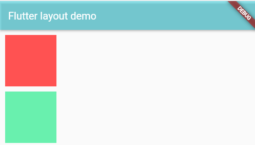
SizedBox 위젯의 height와 width 값만큼 위젯 사이의 공간을 만들기 위해 사용하는 경우
Sizedbox가 편리한 이유는, column에서 쓸경우 width가, Row에서 쓸경우 height가 고정되므로 나머지 하나만 지정해 두면 된다는 점과, 복잡한 각 children 내부의 padding대신 다른 children으로 두기만 하면 되서 디버깅이 쉽다.
|
@override
Widget build(BuildContext context) {
return Scaffold(
appBar: AppBar(
title: Text("Flutter layout demo"),
),
body: SafeArea(
child: Container(
padding: EdgeInsets.all(10),
child: Column(
children: [
Container(
width: 100,
height: 100,
color: Colors.redAccent,
),
SizedBox(height: 10),
Container(
width: 100,
height: 100,
color: Colors.greenAccent,
)
],
),
),
),
);
}
|
'Flutter 앱 > Layout' 카테고리의 다른 글
| Flutter CustomScrollView (0) | 2022.06.21 |
|---|---|
| Flutter Drawer Widget (0) | 2022.06.16 |
| Flutter Theme(테마) 변경 (0) | 2021.12.24 |
| Flutter BottomNavigationBar 예제 (0) | 2021.12.22 |
| Flutter TabBar (0) | 2021.12.22 |

Link2Me